
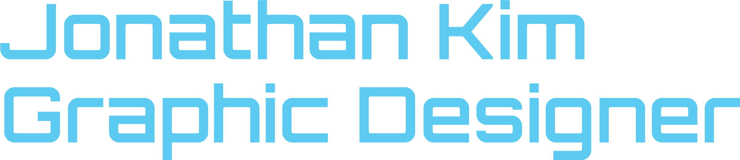


BREAKER
CONCEPT
Breaker is a font that tests the limit of what letterforms are. Breaking letterforms into many pieces allowed people to imagine what the letterform is.
PROCESS
Inspired by the United Sans’s geometric shapes, I created a similar font that has been broken into pieces. The idea of breaking the letterforms was inspired by a misprint of my first design of the font where a few of the letterform’s strokes were cut off. The misprint intrigued me and I wanted to test how much of the stroke can be cut off and still be recognized as the letterform. This allowed me to experiment with the idea and create a pattern with the letterform which created a font that is unique in its way.

POSTER
The specimen poster is designed to promote the font and show how it can be used in different creative projects. It shows how designers can create appealing and attractive designs with the font which includes posters, presentations, brands, advertisements, and many more.

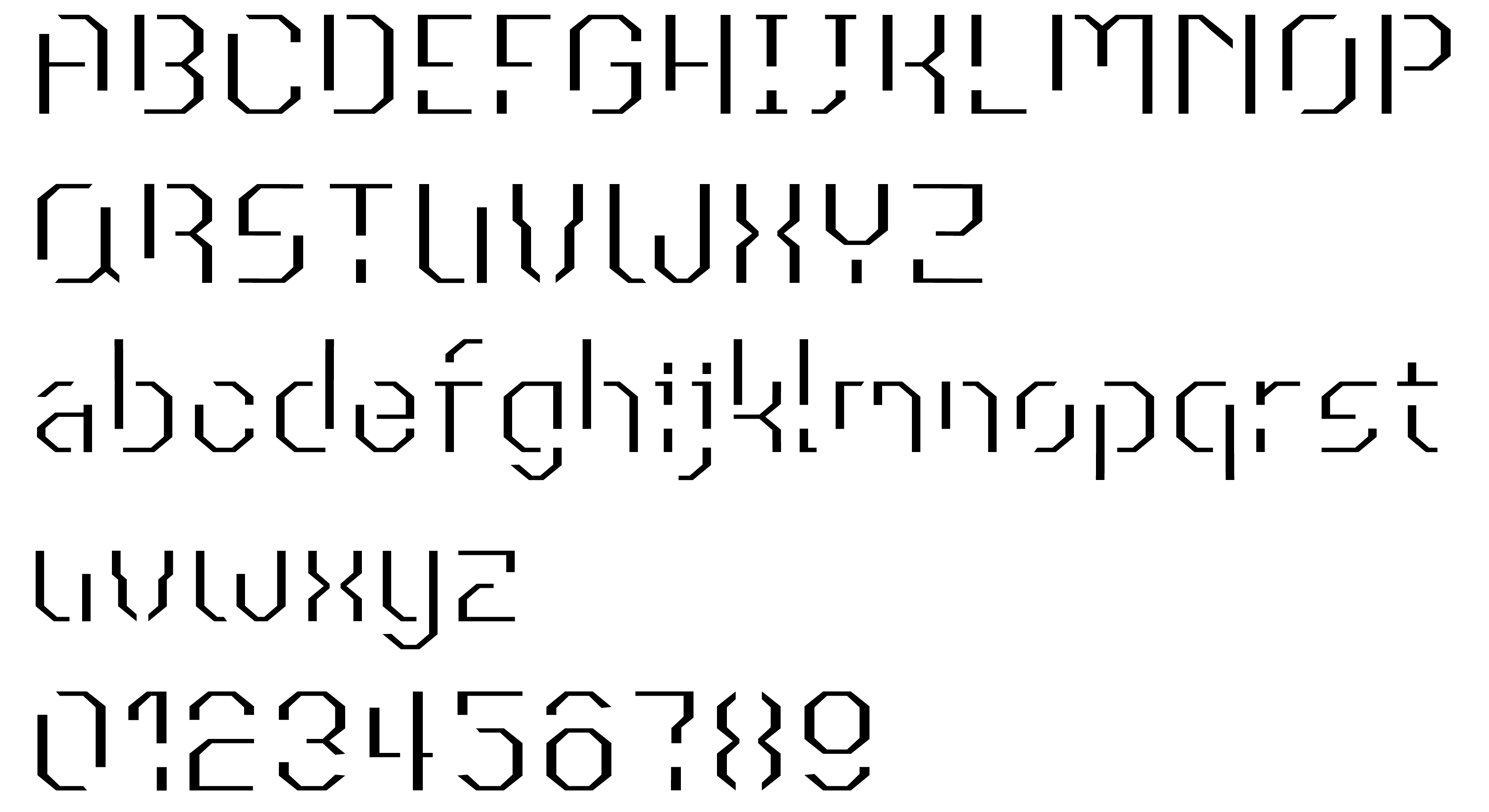
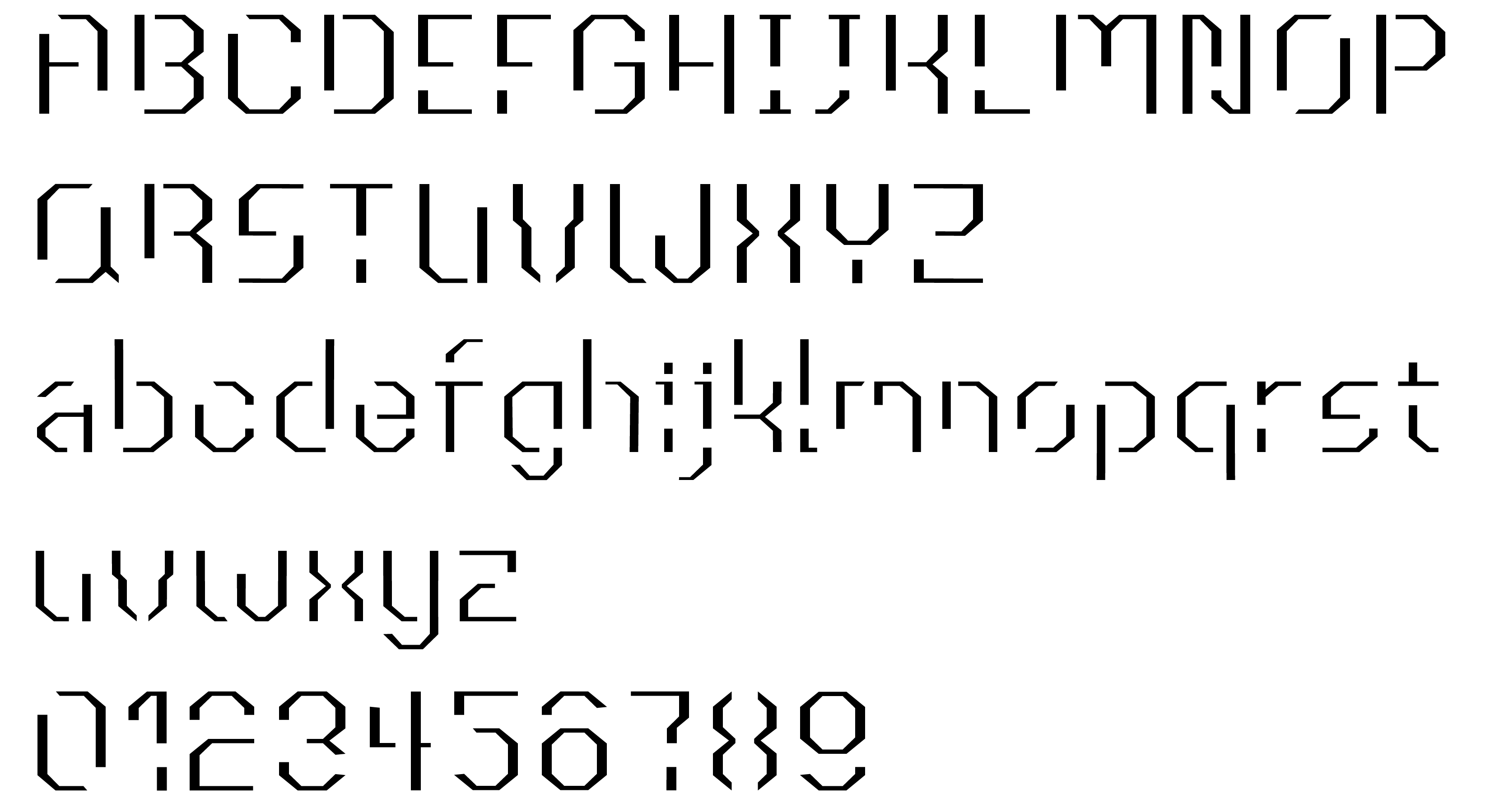
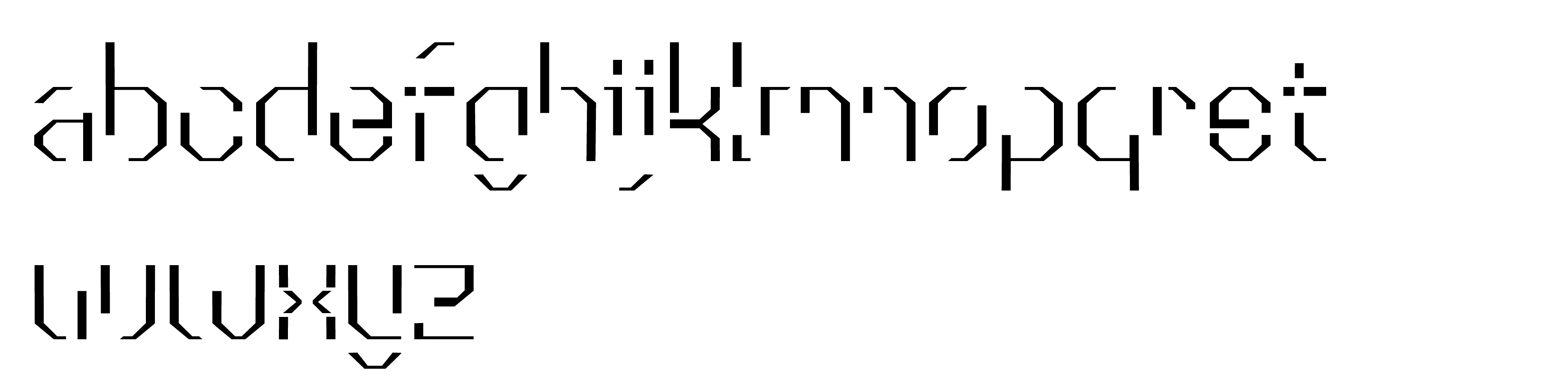
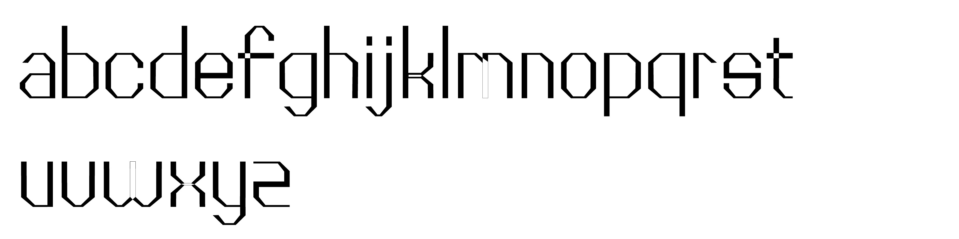
PAST VERSIONS
Showing past versions of my font shows the challenges and inspirations that I had when designing the letterforms. It shows my thought process when experimenting with the font and shows how it has influenced my design.
VERSION 6
VERSION 5
VERSION 4
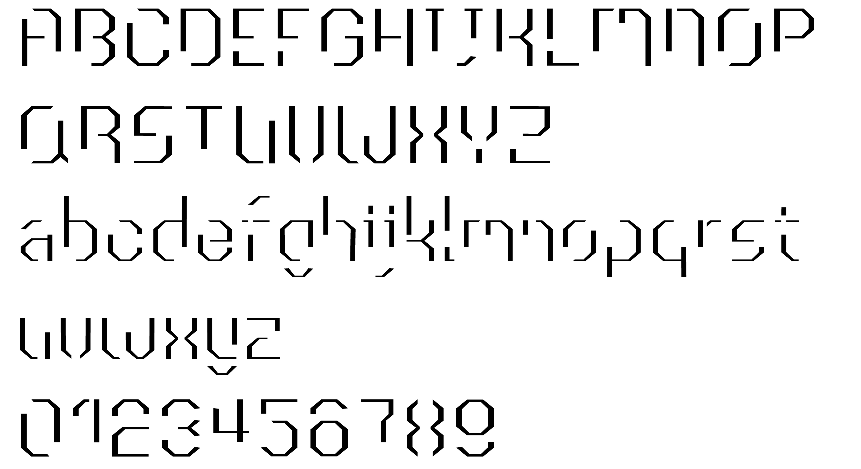
VERSION 3

VERSION 2
VERSION 1
CONCLUSION
This was a good learning experience for me since I haven’t designed letterforms before. Experimenting and designing my letterforms allowed me to expand my knowledge of typography and helped me understand the basic rules of designing letterforms. This experience allowed me to think about how I could use the knowledge and skill of designing letterforms in future projects.